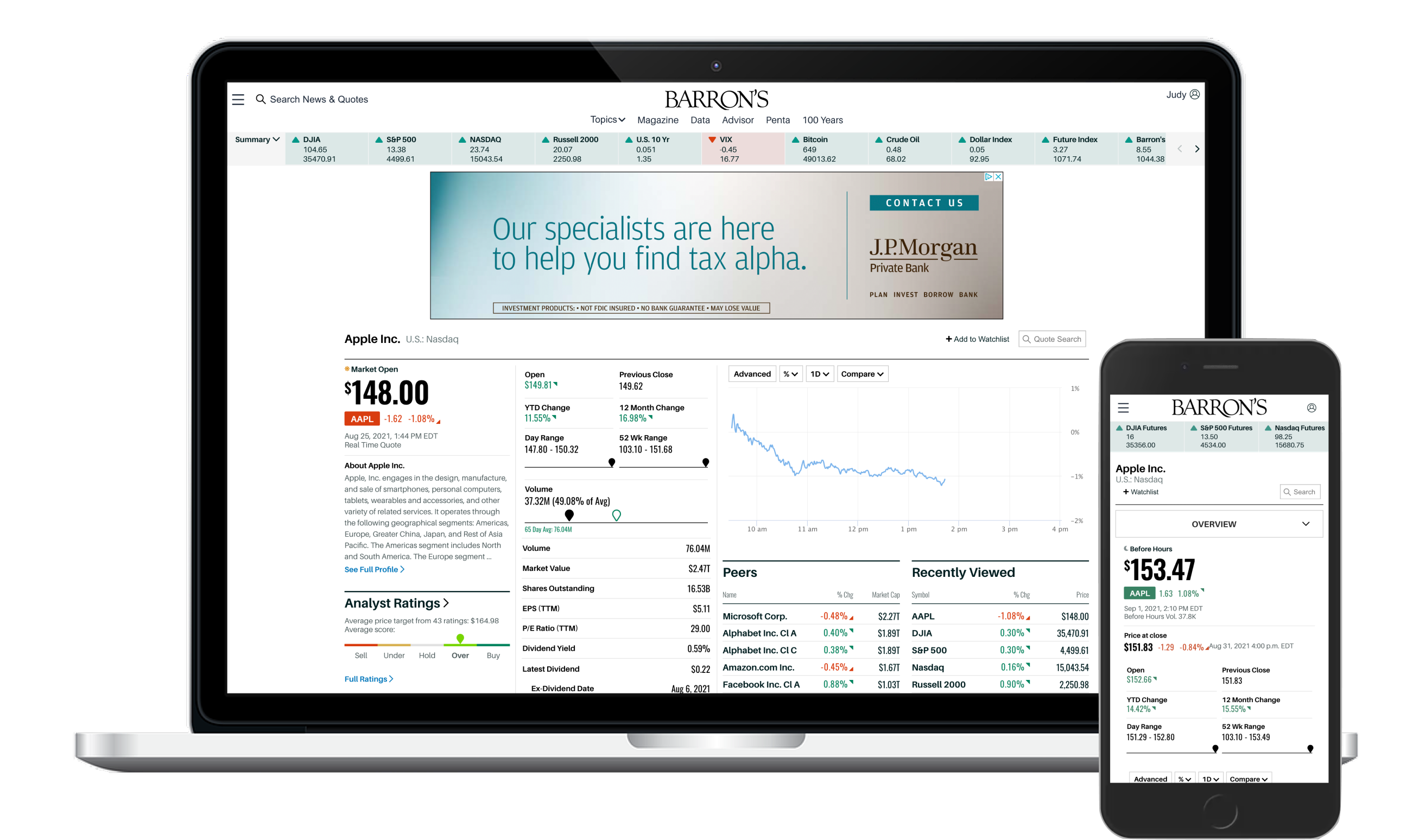
A Pandemic, a Traffic Surge, and Two Very Different Readers
Barron's is a financial content brand known exclusively for providing deep insights and predictions on global and domestic financial markets and companies, offering actionable information for investing professionals. Barron's offers subscribers and users tons of in-depth analysis via industry-specific articles. Barron's traditionally did not attract pure novices new to investing as it doesn't really offer 101s or investopedia type articles. Barron's, as a brand, assumes that readers have some amount of foundational knowledge.
Audience growth was an overall product goal for FY 2021 — most editorial companies are hyper-focused on audience growth as a key metric. This was an OKR at Dow Jones. Then the world changed in March 2020. COVID-19 not only led to a global pandemic declaration by WHO but it started in the United States by way of New York City — the heart of American finance. The product team noticed an interesting trend that kicked off in April 2020: traffic nearly doubled over a matter of days. The vast majority was coming from completely new users. People weren't leaving the house or spending money, and investing was apparently becoming an interesting outlet.
This created a real design tension. Our existing loyal subscribers — many with 5 to 20 years of Barron's reading behind them — had different needs and different mental models than the first-time investors suddenly showing up. And buried in that traffic data was a quieter problem: most users, new and old, didn't spend much time engaging with our financial data even though we produced a lot of it. Many didn't even know our quotes pages existed.
"When I'm researching a stock I want to know what Barron's is saying about it. I don't want to see everything else you published. I go to the site and enter the symbol and I should see what you know about it."
How do we create engaging content for these new visitors while not sacrificing our mission to our existing user base? What can serve both audiences in a compelling way?
My Role
I led a team of 3 product designers and 1 UX researcher through a 5-phase process: Research & Discovery, Strategy, Experience Design, Prototype & Iterations, and Usability Testing. We collaborated closely with Barron's Editorial, Product, and Engineering throughout — not just at handoff.
I led my design team from initial research through launch and built the overall UX strategy based on workshops and information uncovered along the way. One of the things I'm most proud of from this project: Editorial was in the room from the beginning, not just brought in at the end to validate.
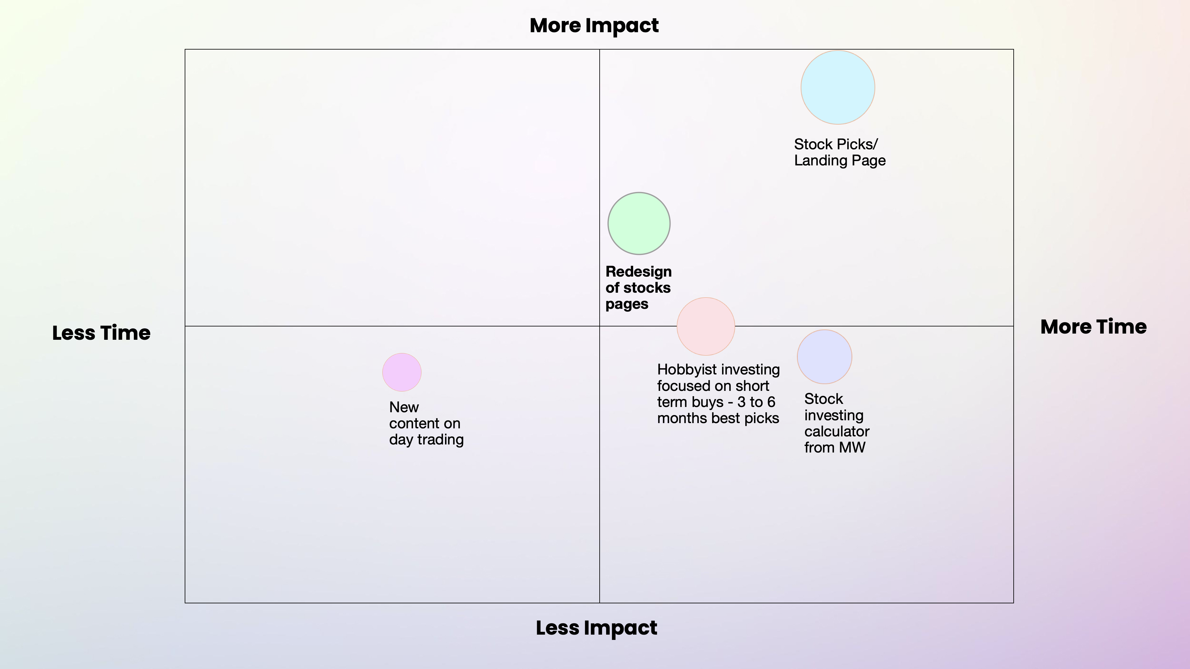
Research First, Then Workshop, Then Design
↓Click the video below to watch it in full screen.
Interactive Webflow prototype tested across desktop, tablet, and phone.
A Change in Direction — and What We Learned from Testing
After more casual conversations between Product and Editorial, and after getting some initial light feedback from our GM, we felt that pivoting a bit made the most sense. And this was turning into one of those rare projects where we ended up having a bit more time to explore. A true gift.
The quotes page redesign. Research made clear that readers wanted prominent company stats, a large chart with clear historical data, and updated typography and labeling that made the data feel alive. They also wanted sub-navigation surfacing more data than the old designs ever attempted. The old quotes page just didn't illustrate the motion of the market in any meaningful way.
The stock picks landing page. This was the bigger swing. We created a new landing experience that surfaced Barron's editorial picks with high-up news placement, a watchlist feature, and filtering criteria we workshopped directly with Editorial. Data showed that when users interact with the watchlist, page views go up, time spent goes up, and they come back to Barron's sooner — so making watchlist functionality prominent was a deliberate bet.
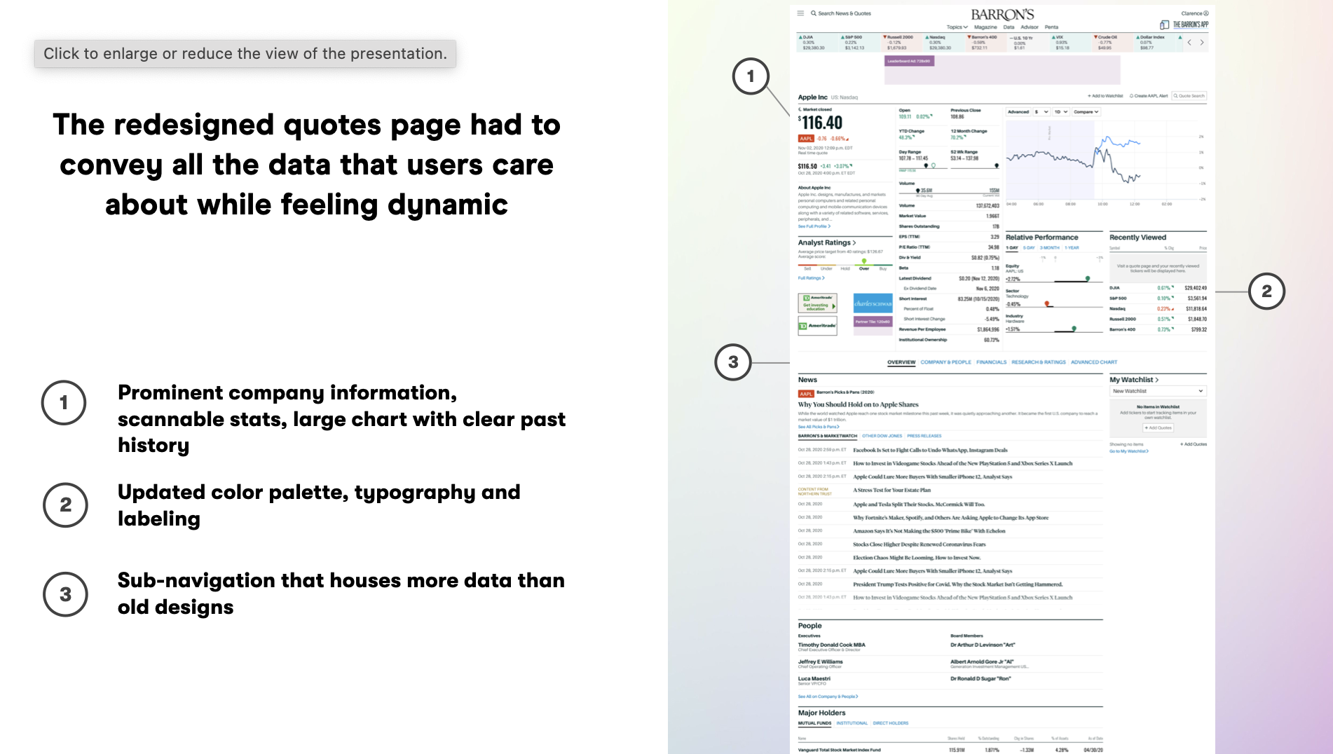
↓Click the video below to watch it in full screen.
Prototype showing the new stock picks landing page and redesigned quotes experience.
Before and After
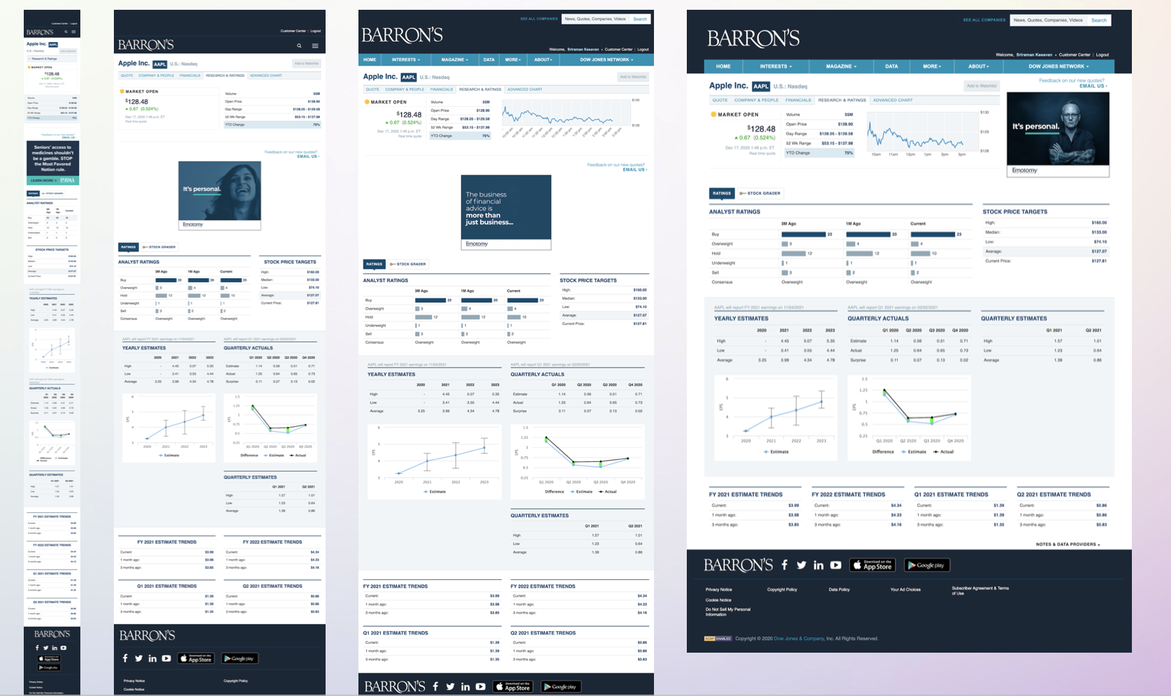
Outcomes
The numbers came in after launch. They confirmed what we'd heard in research: readers wanted this. They wanted Barron's to be the place they went first.