Caring isn't the same as knowing
Somewhere in the last decade, a specific kind of shopper emerged: someone who's decided they care what's actually in their dish soap, their face wash, their kid's shampoo — but caring doesn't come with the ingredient literacy to act on it. What actually happens is five tabs open at once: a blog post, a Reddit thread, the EWG Skin Deep database, the product page, and a screenshot of an ingredient list you're squinting at, trying to remember if "fragrance" is the bad one or not.
Clean Shopper started from that specific frustration. The idea: describe what you're looking for — a dish soap, a face wash, something for the baby — and let the app do the cross-referencing. Evaluate the ingredients, weigh the safety concerns, and give a clean, honest answer: worth buying or not. Save it to a personal library, sorted by category, so the research you did once doesn't have to happen again next time you're standing in the aisle.
Design decisions before a line of code
The project started in design, not in React. Before building anything, I ran a structured intake through a custom Claude Code skill — /project-context — that took a rough project brief and produced a formal context document: problem statement, ideal customer profile, pain points, open questions, and gaps. That document became the north star for every decision that followed about scope, tone, and what to build first versus what to defer.
The design system came next, generated through a second custom skill, /design-system-generator. It produced two artifacts: a browsable HTML file previewing the full visual language, and a markdown spec documenting every design token with the reasoning behind it — not just "primary color: sage green," but why sage, why paired with warm sand and soft teal. The palette was built to hold three feelings at once: safety, warmth, and clarity. No color that shouts. Poppins across the full type scale, set on a Major Third ratio. Shapes slightly rounded but not precious — 8px radius on cards and buttons, 16px on modals.
A component spec followed the design system, before any component existed: nine components — Button, InputField, SearchBar, SafetyBadge, CategoryTag, ProductCard, NavBar, EmptyState, Reveal — each documented with props, visual structure, states, and usage rules. The rule enforced throughout the build: check the spec before building any UI element, and if it exists, use it.
How it's put together
Where the product actually earns its name
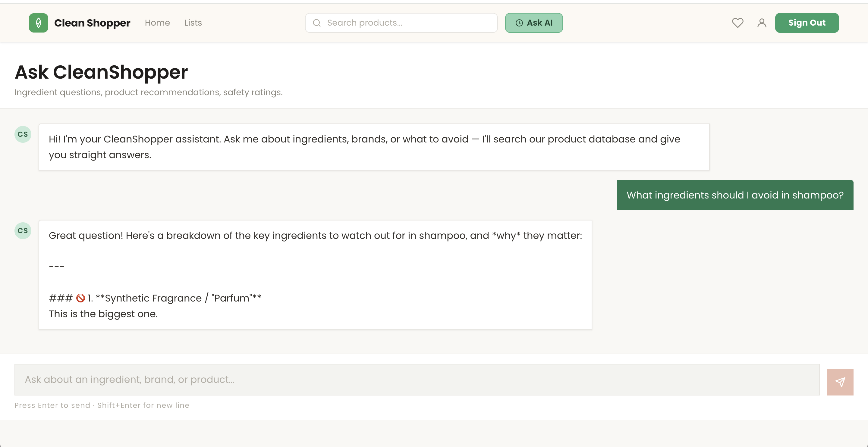
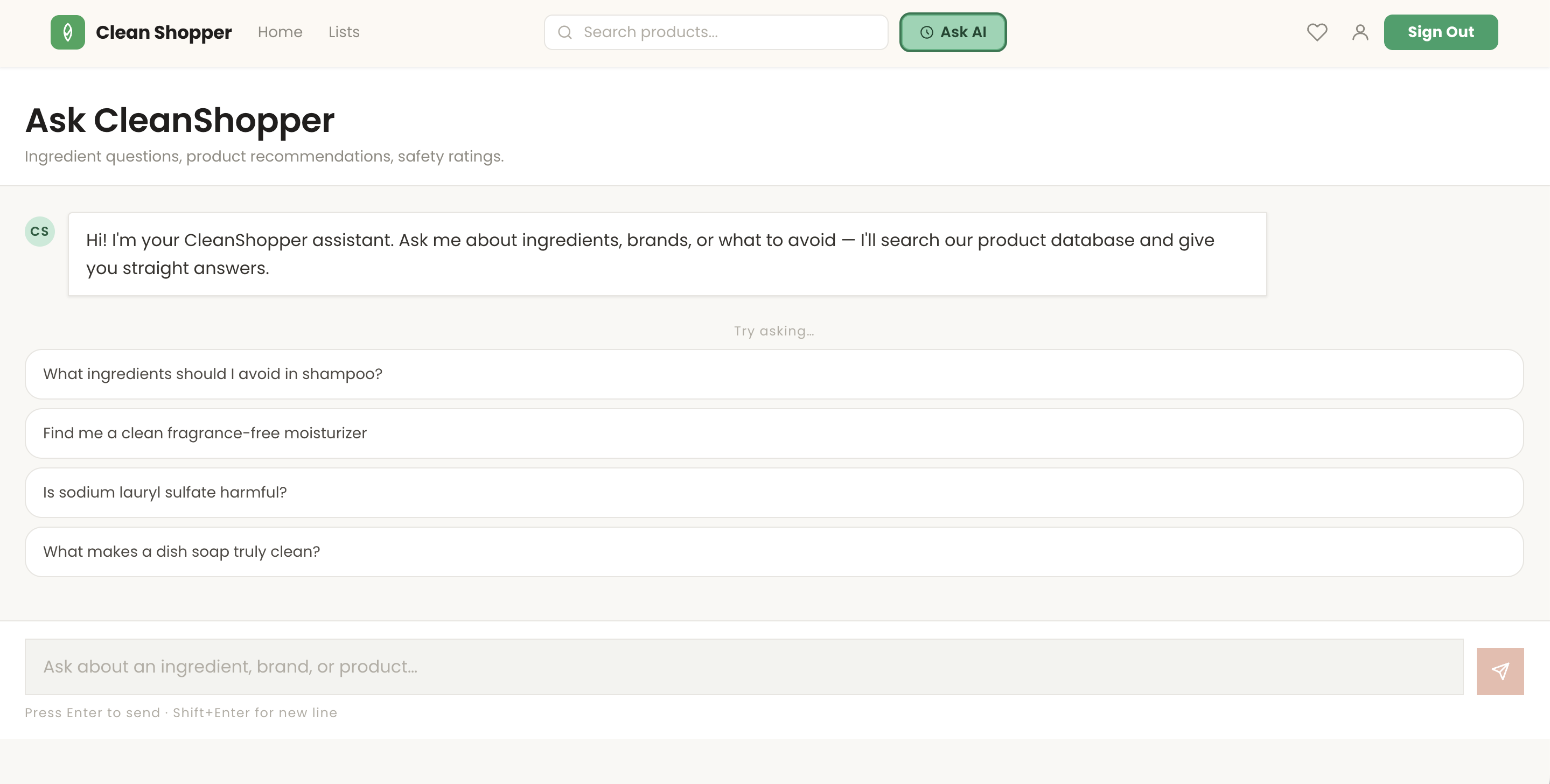
The "Ask AI" chat is where the product concept lives or dies. It's a conversation, not a search box. The user asks about a product, an ingredient, or a whole category — "is this baby wash actually clean" — and the assistant answers with reasoning, not just a rating.
Under the hood, the chat function has access to a Supabase tool that lets it query the actual product catalog. So when the user asks about something in the catalog, the model can look it up and cite what's there. When they ask about something outside it — an ingredient, a comparison, a general question — it answers from its own reasoning and flags that it's speaking generally.
Reasoning over rating is the actual design decision. The system prompt instructs the model to think like an ingredient-aware research assistant: cite the safety reasoning, don't just return a verdict. A verdict without reasoning is a coin flip the user has to trust. Reasoning is what lets them build their own literacy over time — which was the point.
Two surfaces, two different jobs
What's live today
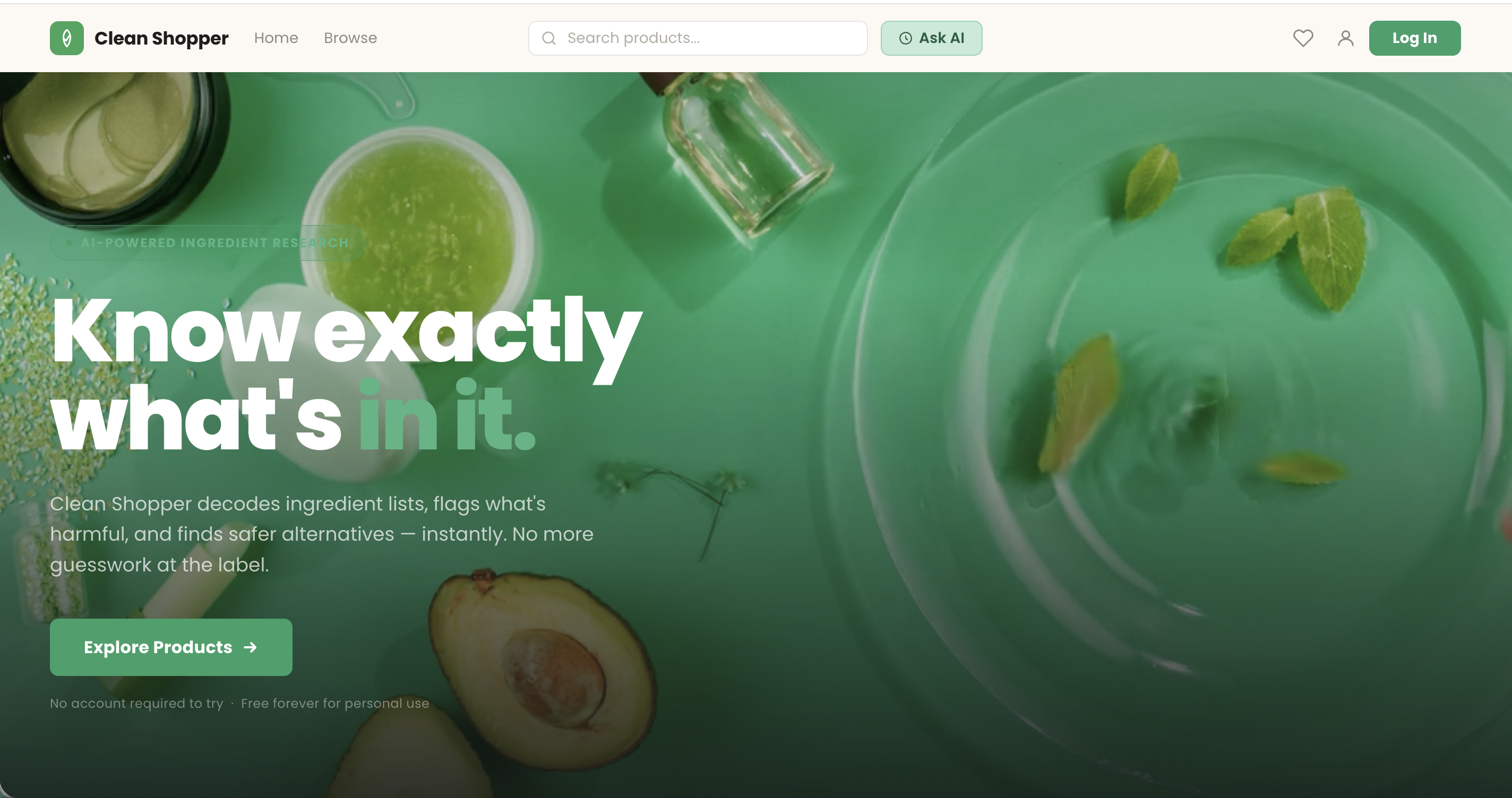
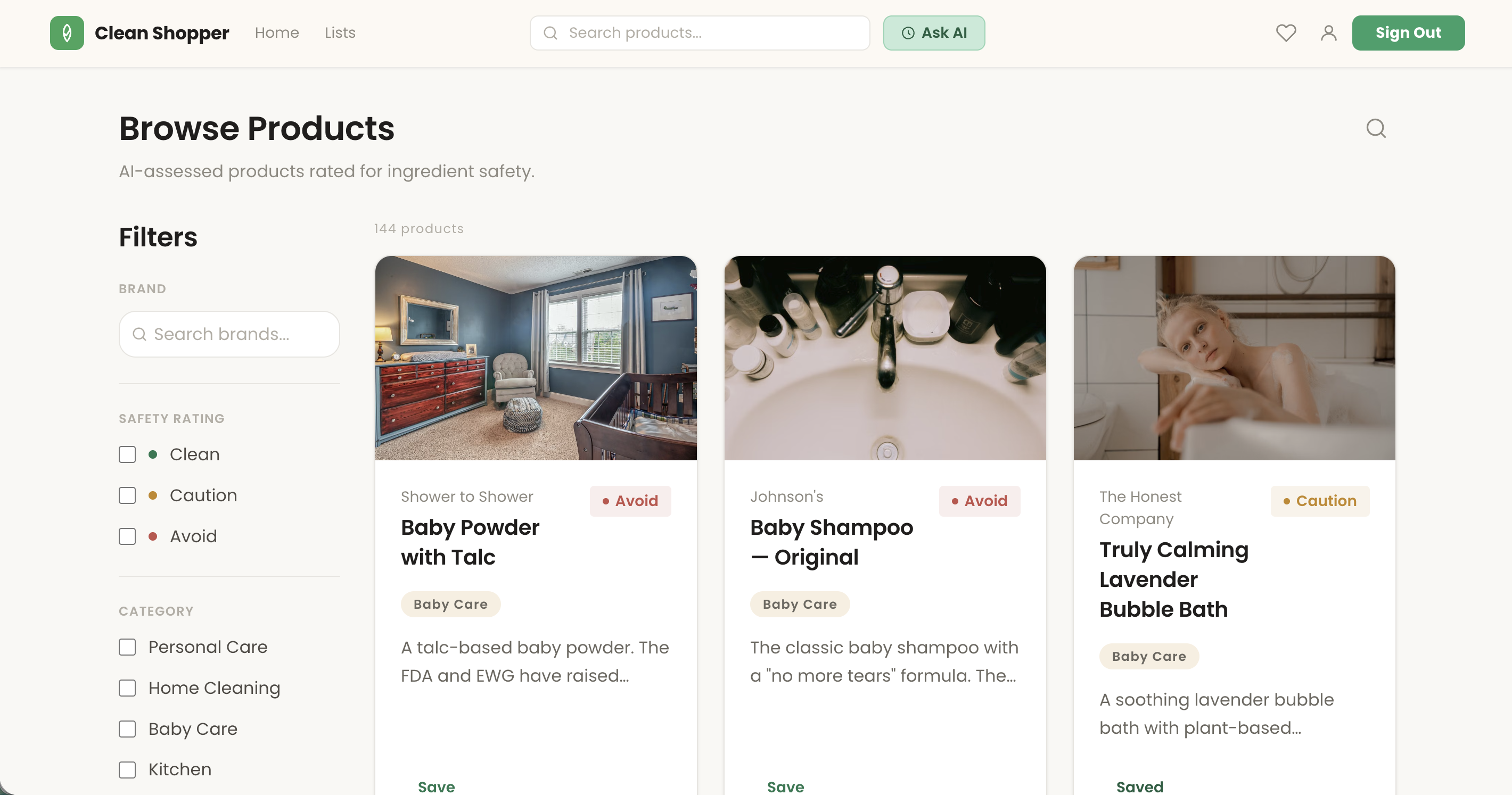
A marketing landing page, full Supabase auth, a seeded product catalog, and an agentic AI chat — all deployed and usable end to end.
A free account is required to view the live site.