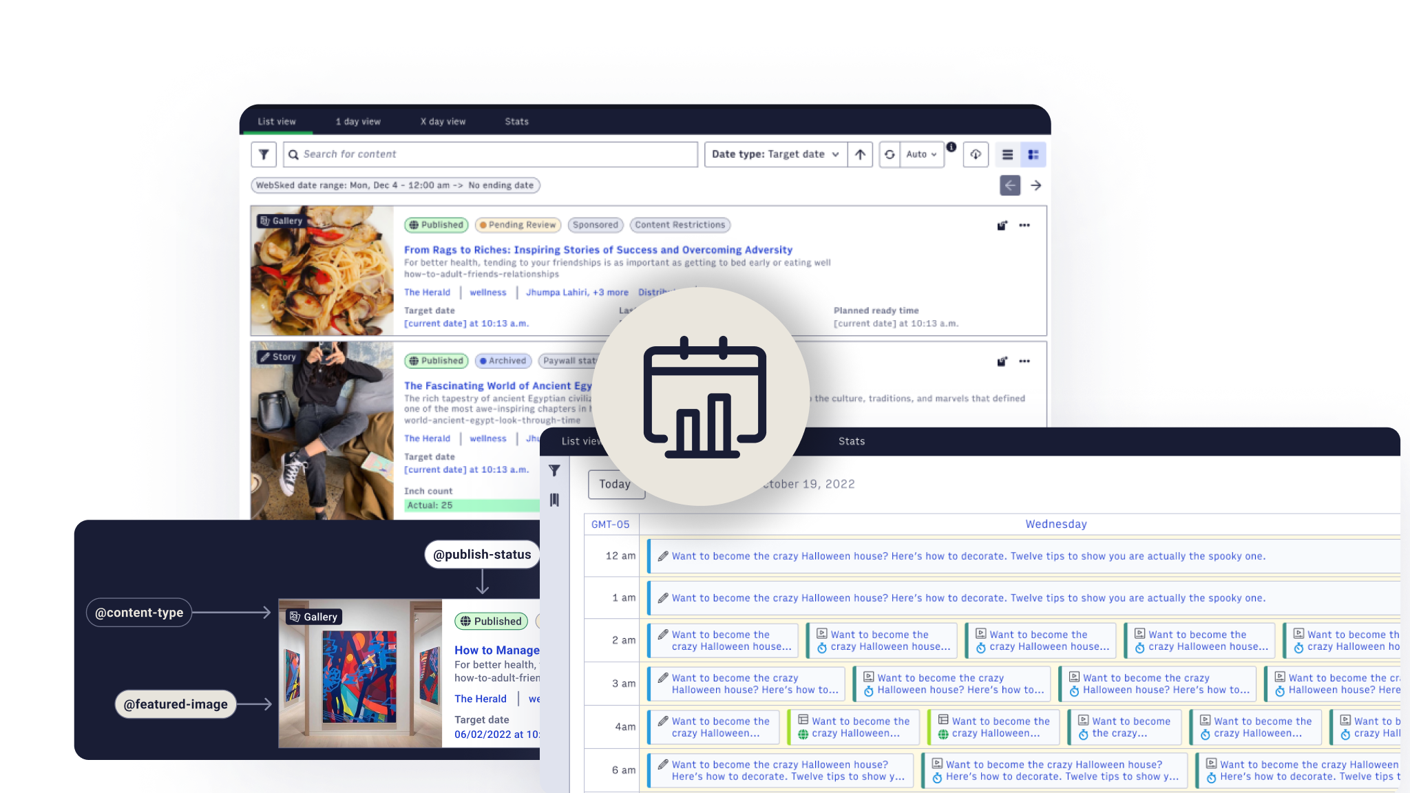
Washington Post/ArcXP · B2B · Enterprise

Overseeing usability for the next generation of content planning tools for newsrooms

Overseeing usability for the next generation of content planning tools for newsrooms
Click to enlarge

Large media organizations publish several articles, galleries, and videos every hour, and editors and journalists must manage these large amounts of complex content daily. The challenge lies in offering a solution that helps users quickly identify and interact with relevant content, despite the vast volume and variety of content types. This case study covers March 2023 to October 2024 and features multiple projects aiming to meet the needs of users of the WebSked platform — from engineering and design QA to GTM, launch, and beyond.

Role
Lead Designer
Team
1 PM, 3 engineers, myself
Duration
Delivered in 2–3 month phases over 19 months
Tags
B2BEnterpriseUX ResearchEditorial
Problem

When your users manage 80 stories an hour, 'good enough' isn't good enough

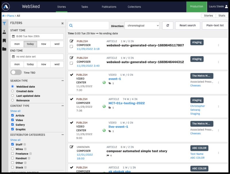
Large media organizations publish several articles, galleries, and videos every hour, and editors and journalists must manage these large amounts of complex content daily. The challenge lies in offering a solution that helps users quickly identify and interact with relevant content, despite the vast volume and variety of content types. WebSked, an application within the ArcXP platform, aims to be this solution.

Based on numerous help tickets, qualitative interviews and stakeholder feedback — particularly from technical sales and customer support — it became apparent that improvements were needed to WebSked around efficiency. How can we increase the efficiency and engagement of editorial teams using WebSked? How can we streamline content management workflows in Arc XP's WebSked platform?
Click to enlarge

"We need story cards with minimum info to help get a global view of the daily plan at a glance. We have 70-80 stories a day."

The Business Objective

How can we increase the efficiency and engagement of editorial teams using WebSked? How can we streamline content management workflows in Arc XP's WebSked platform?

My Role

From first audit to final QA: design leadership across the full product lifecycle

As the main design stakeholder, my main goal was to understand the current state of the application and work with stakeholders and leadership to uncover the best steps forward in revamping the application. Once the application was understood I worked with the team to create a vision of the most used pages and user flows.

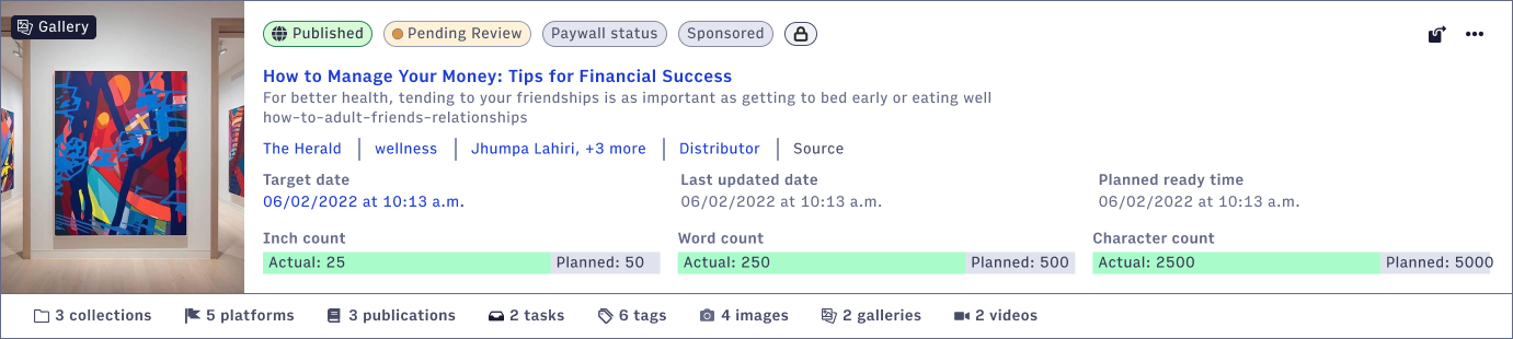
I conducted extensive user interviews to understand how users defined complex content cards, the priority of data, and additional metadata needs. I systematically categorized all the data the application had access to, defined the most complex and simplest versions of a content card, and ensured the cards were responsive and adaptable to different screen sizes and international right-to-left (RTL) layouts.
Click to enlarge
Process

Start with the user task, not the feature request
01
Audit & user research
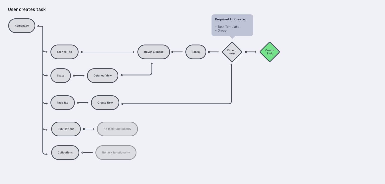
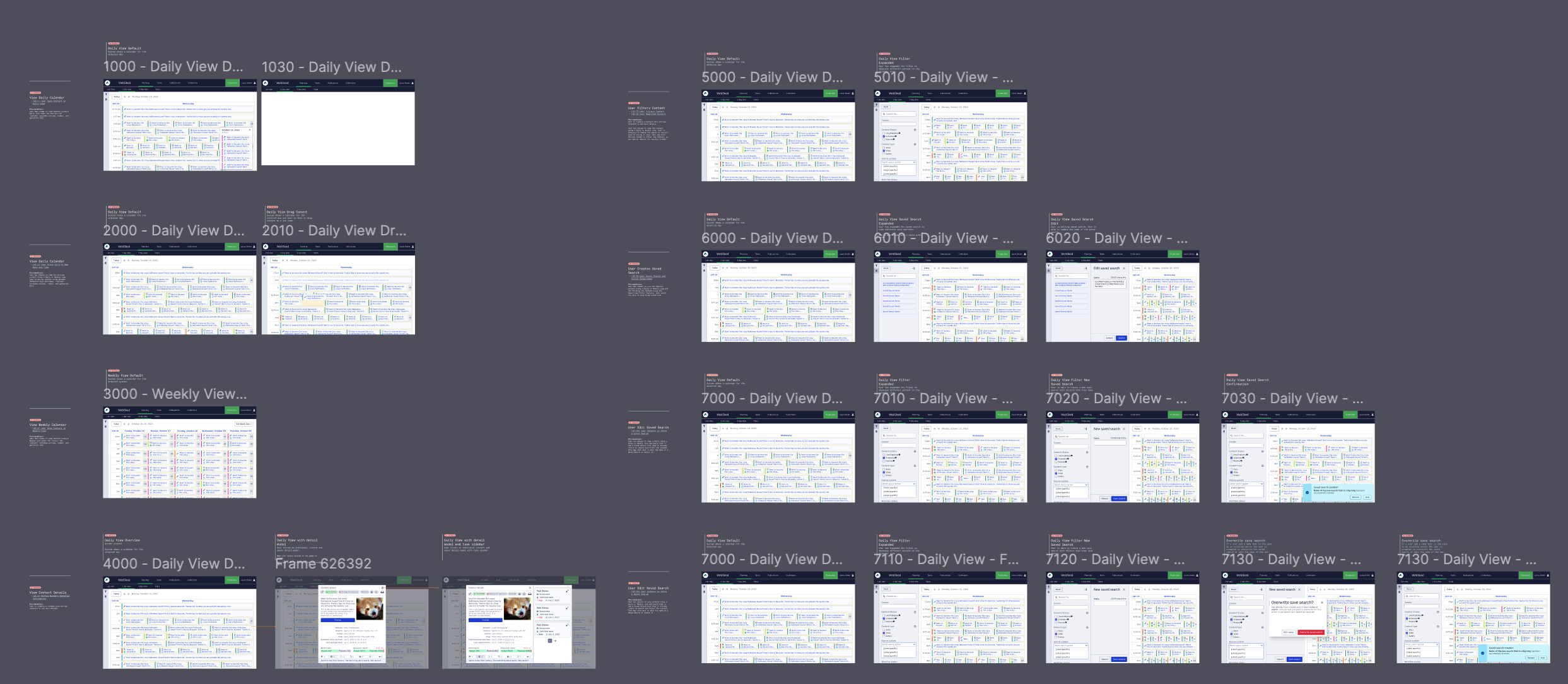
Created a site map and user flow of the major actions users run within the application. Used Pendo.io to benchmark key actions before future updates shipped.
02
User interviews
Reached out through Technical Account Managers to interview clients who used WebSked daily, weekly, or monthly — 30–45 minutes each, consistent script, uncovering recurring themes and personas.
03
Calendar View
Persona research revealed that more than half of users needed a better way to view content on a linear schedule. Ran additional research via Respondent.io with digital marketing and enterprise users to validate the direction.
04
Search & information architecture
Explored four distinct search approaches and their tradeoffs. Used wireframes to align leadership and engineering on direction before moving into visual design.
05
Content Cards
Ran card-sorting workshops with internal teams and clients to define data hierarchy. Iterated from low fidelity through responsive and RTL versions, validating direction with surveys throughout.
06
Usability testing & launch
Led usability testing across all three features. Oversaw engineering, design QA, GTM, and launch over an 18-month period.
Click to enlarge

Click the video below to watch it in full screen.

Video · No audio
Calendar View usability testing session.

Recorded walk-through of week-view interactions and filter use.

Key Decisions

Three times research changed the plan — and why that was right

Calendar View: removing the "Not Assigned" section. The original calendar design included a top section showing unassigned content — originally thought important to give users visibility of potential tasks. Feedback from usability tests and surveys informed us that users would rather filter content and save that space, allowing them to view more relevant content at once. The research overrode the original assumption.

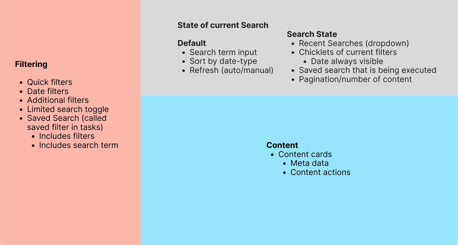
Search: letting users define the architecture. Rather than defaulting to a direction, we used wireframes of four different approaches — inline horizontal filters, peak overlay, inline vertical filters, and top overlay — to drive a conversation with leadership and engineering. The interview process also continually updated our understanding of use cases, so the final architecture evolved throughout the project.

Content Cards: maximum data, minimum space. Survey results throughout the design process showed that users liked the content cards with the most data possible, but wanted the card to take up little vertical space to see as many pieces of content as possible at once. This finding directly shaped the final card design — dense but scannable, flexible enough to support RTL layouts for international users.
Click to enlarge

Click the video below to watch it in full screen.

Video · No audio
Search usability testing session.

Recorded walk-through of search and filter interactions.

Before & After

From cluttered to scannable: the planning page redesign
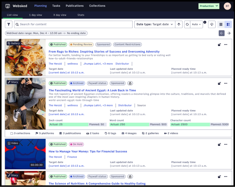
Original Stories (Planning) Page
Click to enlarge
The original planning page made it difficult to quickly identify and interact with relevant content, despite users managing dozens of stories per hour.
Redesigned Planning Page
Click to enlarge
The redesigned planning page provides a more scannable and efficient way to review large amounts of content, with improved search, filtering, and content card design.

Content Cards: from low fidelity to final design
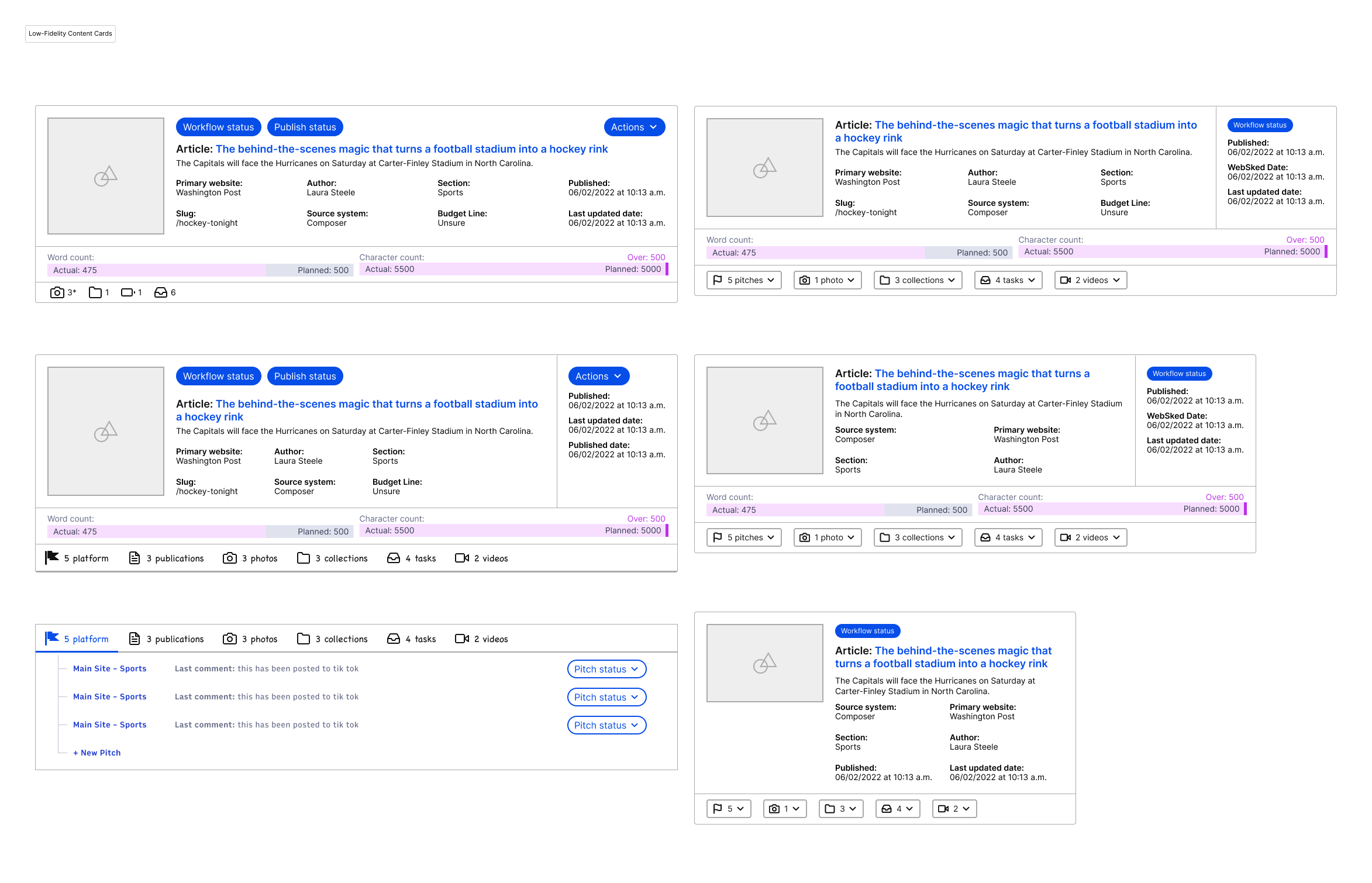
Low Fidelity — early iteration
Click to enlarge
Early-stage content cards exploring data hierarchy before card sorting and user validation informed the final direction.
Final Content Card
Final Content Card
Click to enlarge
The final card — dense but scannable, flexible across content types, and fully adapted for both LTR and RTL reading directions.
Outcomes

Impact across three launches

Increased editorial team engagement with WebSked by 25%, measured by the frequency of interactions with key features like the calendar view and search functions. One-third of users promptly incorporated the new calendar view into their daily workflows after launch. Content cards earned a 90% user satisfaction score and drove a 68% workflow improvement.

25%
Increase in editorial engagement
Measured by frequency of interactions with key features including calendar view and search, tracked in Pendo.
40%
Reduction in task time
Measured by benchmarking done in Pendo before and after the updates shipped.
90%
User satisfaction — Content Cards
Post-launch survey result for the redesigned content card across internal teams and clients.
Learnings

What this project taught me about design leadership at scale

01
Continual feedback is not optional — it's the processBy spending time understanding users at the beginning and doing check-ins throughout, we never arrived at the end with a product that didn't work for users. The projects that stayed closest to users had the strongest outcomes.
02
Information architecture creates team alignment before design startsWorking through different layout approaches for search empowered the full team to understand what was possible and buy into the direction — without getting distracted by visual design too early. These IA conversations were some of the most valuable of the entire project.
03
Design for flexibility and you serve both users and the businessThe final content card was flexible but robust — supporting RTL layouts and reusable across the entire ArcXP ecosystem. Designing for edge cases reduced future design and tech debt while expanding the product's market opportunity.
Next project
Clean Shopper